Exercises
Web Improvement
For the web improvement project, I decided to revamp my storyboard project from web 2. This was a project wherein I initially had to make a small site wherein it was meant to display a storyboard of a short story. I decided to revamp it due to it looking pretty bland for the rest of the effort I put in, having added my process in making the project on that site, requiring further js than was required.
Comments
- Too bland
- Storyboard not responsive
- Background disappears when swapping between tabs
- Items too close together
Changes
- Added space between elements
- Fixed the background disappearing when swapping between tabs
- Fixed content in tabs being oversized on smaller screens
- Smooth scroll when clicking in the nav
- Added background so it's less bland
- Removed background from the top nav to create a cleaner look
Print Improvement - Poster
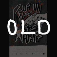
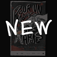
For the print improvement, I decided to revamp my poster meant for the McCord Museum poster contest which was a project from the 5th semester as, looking back, there were many things I saw I did wrong such as the date of the project while also really having liked originally making that project. The goal of it was to design a poster to be submitted to the McCord Museum's poster contest under the theme "Pour un Monde Sans Armes", a theme around weaponry.
Comments
- Wrong Year
- "Weirdly Open" for something meant to be threatening
- Bottom part looks weird, "too much"
- "Why is the water shooting behind the 's'"
- Should highlight the illustration more to make it easier to understand
Changes
- Corrected mistakes. (e.g. the year)
- Added a border to create a more boxed and stressful feeling
- Changed the bottom part on how all the information is shown
- Highlighted the illustration to push it forward and improve visibility.